Variaciones Borges Journal
A publication design project for the Borges Center at the University of Pittsburgh.
Variaciones Borges is a journal of philosophy, semiotics and literature, published twice a year by the University of Pittsburgh. The publication is run through the Borges Center, the most important site for scholarly work on the Argentine writer Jorge Luis Borges (1899–1986). The editorial mandate of the journal goes beyong the publication of sholarship on Borges to include “Borgesian” narratives:
Reaching beyond pure exegeses of Borges’s writings, the journal aims to explore the special style of thinking, writing and reading in which Borges excelled. Fantastic ontologies, synchronic genealogies, utopian grammars, fictional geographies, multiple universal histories, logical bestiaries, ornithological syllogisms, narrative ethics, imaginary mathematics, theological thrillers, nostalgic geometries and invented remembrances converge to justify the epithet “Borgesian” for a special area of academic research, in which philosophy appears as perplexity, thought as conjecture, and poetry as the deepest form of rationality.
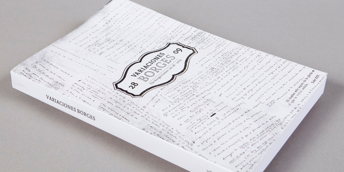
The journal is produced inexpensibly in print, and as an ebook in the EPUB format since issue 31. I redesigned the journal interior and cover label in 2009 aiming to reflect back to this community’s their identity into the journal, making this object “something to gather about,” a material instance of a shared experience in scholarship. The choice of typeface became an essential component to the identity of the journal, and was embraced by the journals’ community with utmost pride.
The design of the journal accomodates for articles published in a range of languages including Spanish, English, Portuguese, and French. In the print journal, the text is set in Borges, a classic humanist serif typeface designed by Pampa Type’s Alejandro Lo Celso and inspired by the writer’s fantastic stories. Each issue is produced following my stylesheets and in doing so new demands are placed on the design to accomodate, for instance, extended character sets not included in the original font. To solve this particular issue, I learnt how to edit a font and designed a handful of missing characters to match the typeface.
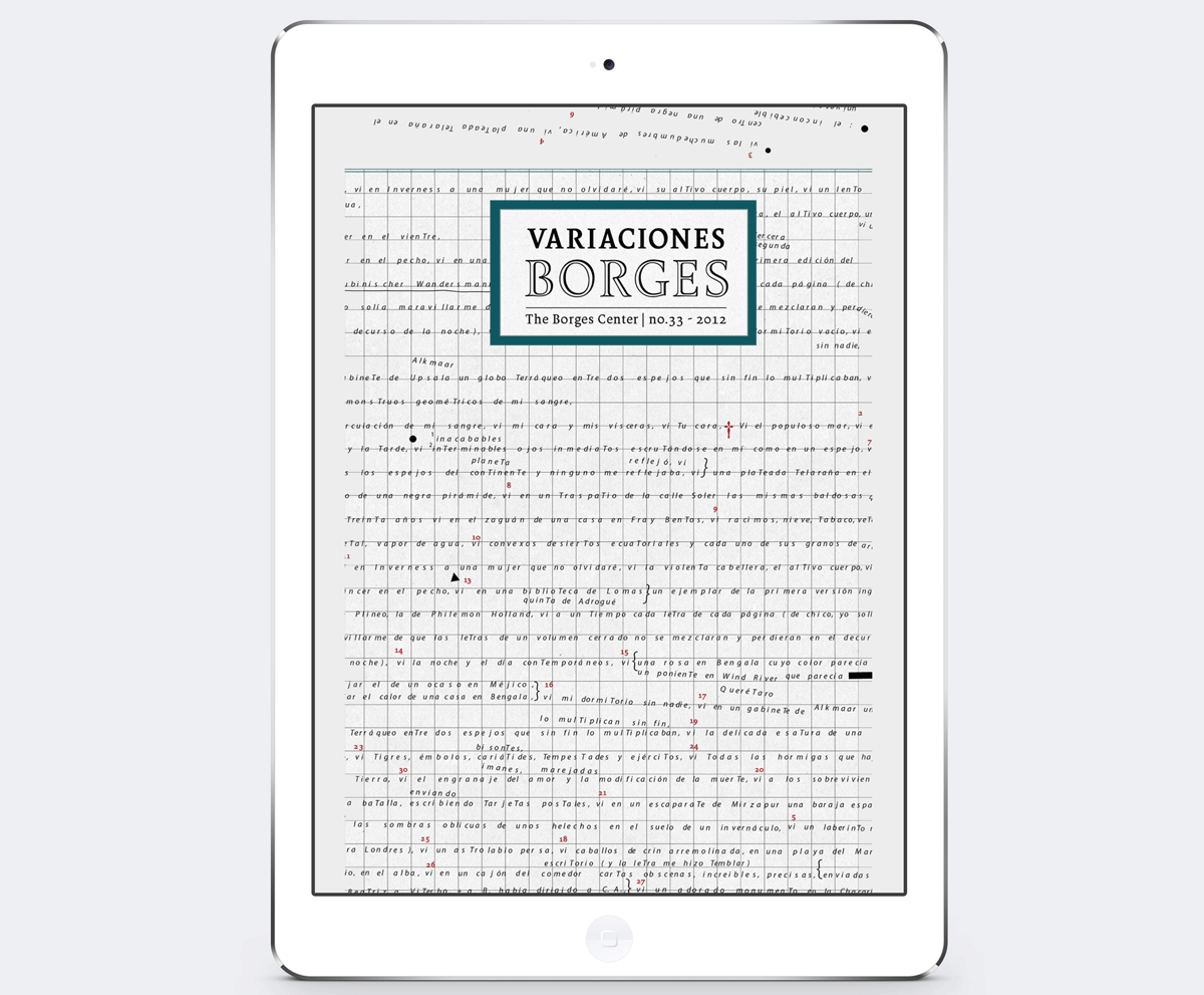
The journal’s title label was designed to be a self-contained element making its placement in the page flexible and responsive to the image selected for each issue. Every cover image is loosely inspired by the themes in the lead article in the issue. In Variaciaciones Borges 33, Daniel Balderston reflects on Borges’s very long sentence in the short story “The Aleph,” and I recreated the corresponding manuscript page from a facsimile into a typographic version of the page including Borges’ annotations. Of the cover, Balderston wrote in his editorial note to that issue of the jornal:
Sample pages from Variaciones Borges 33, 2012.
Variaciones Borges EPUB
The ebook version of Variaciones Borges was set as reflowable xhtml text for ereaders such as iBooks and Kindle. The type was set following a double stranded modular scale using 16px and 20px base sizes and a golden section factor. Because ereader software flows text withing predetermined margins and allows users to adjust type size, the crucial relationships to be established in the book are set through vertical spacing and type sizes. A modular typographic scale set in ems sets a fluid system and helps establish and maintain a set of proportions as user adjust overall sizes.
Because the EPUB format is a compressed set of files which contains the fonts (which can then be redistributed), and in order to avoid licencing conflicts, I chose a new typefaces for this version of the journal: PT Serif and PT Sans by ParaType. Both typefaces were released with a libre license and can be freely redistributed. A humanist sans and a transitional serif with humanist terminals, they were designed to work together and include a generous range of weights and optical sizes.