Type of the Century
Digital Publication Design, summer 2014.
Type of the Century is a collection of seminal articles in typographic discourse that explores dynamic principles in publication design for touch-based tablets. The publication was developed during the summer of 2014 with two undergraduate students, Alan Maranho and Lucas Lopes using the open-source framework Baker.
The goal of the project was to investigate layering in screen based layouts and the potential of incorporating a live, kinetic substrate for the publication. We posed the questions, “How can dynamic media be integrated in digital publications and what principles are emerging in this integration?” “How do we best communicate these seminal writings to an audience of undergraduate design students?,” “How do we enable users to participate more actively and interpret or respond to the writings in a way that helps them comprehend their arguments?” and “How can these resources be used in a studio classroom setting?”
To address our research goals we implemented a series of design strategies:
Dynamic titles: the titles for lead articles, such as Marinetti’s “Words in Freedom” and Warde’s “The Crystal Goblet” were introduced over a looping video that sets the tone of the piece. Here we are looking at the use dynamic media to set a mood and not as a content destination. The video continues to play in a blurred mode over the introduction text that follows the title. It later reappears behind the pull quotes.
Animated cues: interaction cues through the publication are presented as animated icons. With no hover mode and rich graphics, the indication of a button in digital publications can be difficult to signal; adding minimal animation proves to be an excellent strategy when determining actionable content. In some instances, animation helps us lead readers to action without the need for supporting text. This is the case in the CSS-animated “plus” button on top of the author’s portraits which signals extra content in the form of a short biography.
Annotation: we included live annotation tool that works offline and is based on selection of text at any level (word, sentence, paragraph). A standard feature of most ereaders, annotation is yet a challenge for stand alone applications with no CMS back-end. In this project we used a custom version of Annotator by Aron Caroll, a Javascript plugin to allow local storage of comments.
Text composition exercise
Typeface overlays
Typeface sections
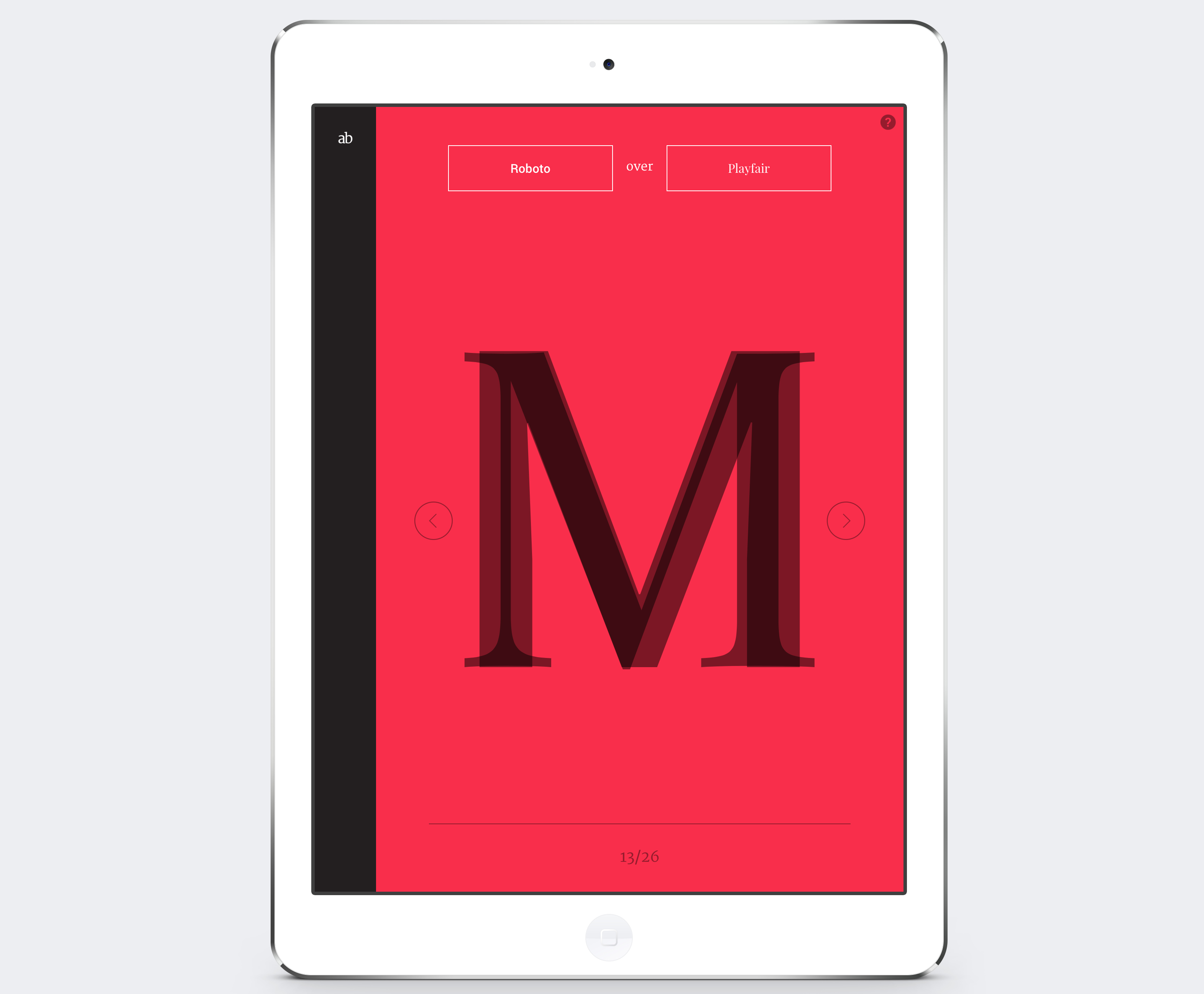
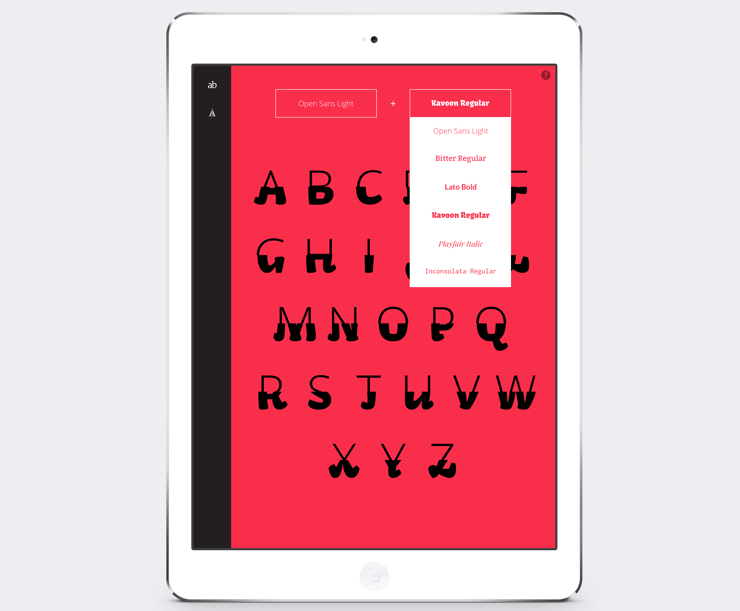
Playful exercises: a series of play-oriented working spaces encourage users to explore typefaces’ design and typesetting, and ultimately produce an image that can be captured with a screenshot.
Two of the games emphasize the typeface’s formal features: one examines styles by overlapping large scale letterforms of different typefaces based on the reader’s input, the second dissects (vertically and horizontally) and contrasts entire alphabets in lower and uppercase also based on the reader’s typefaces choice. These two performative spaces are intended to engage the reader into a playful exploration of similarities and differences, revealing through contrast a typeface’s structural and formal features, helping them notice their uniqueness.
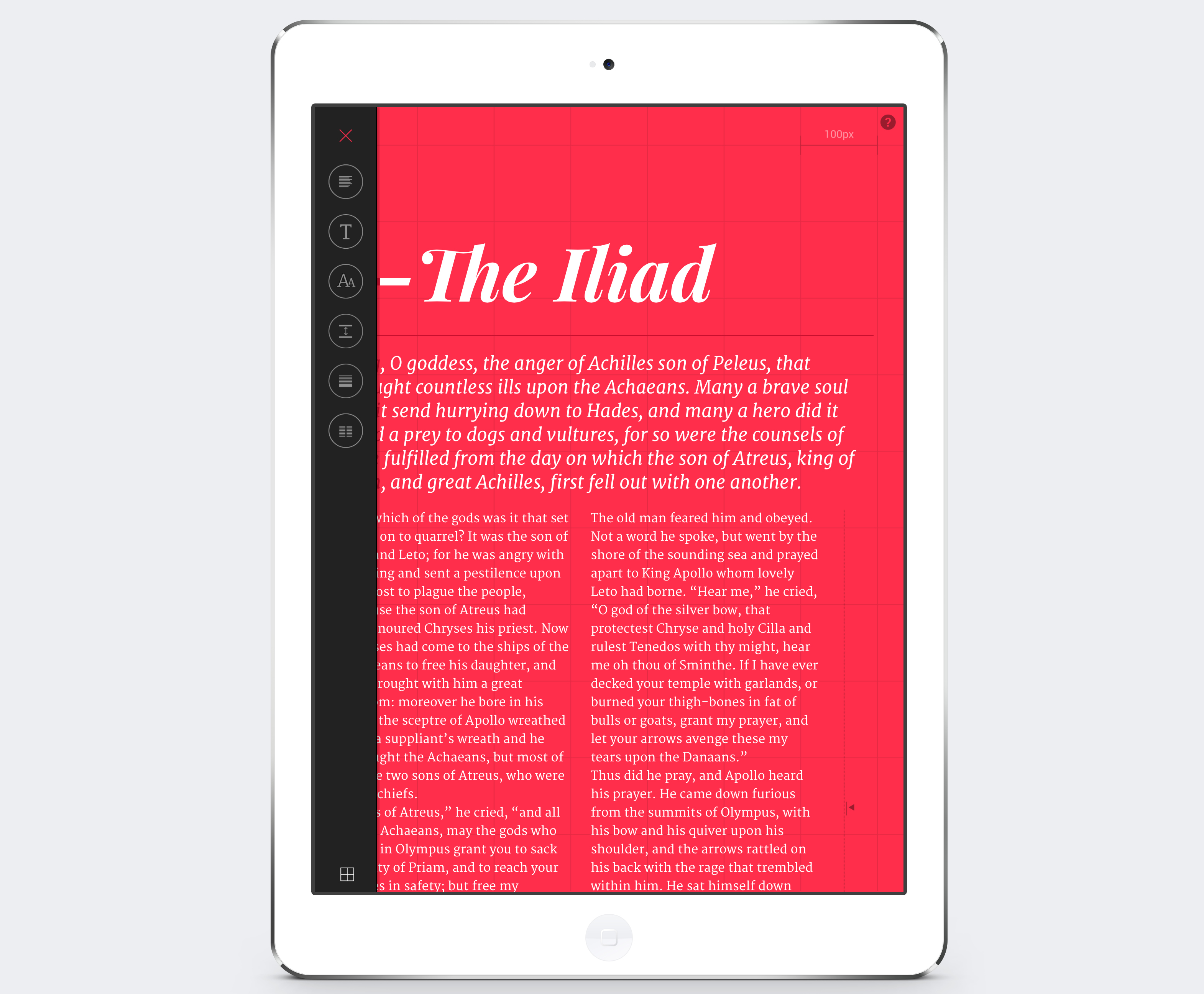
The third exercise is a typesetting tool that lets reader’s adjust three levels of text: heading, introduction, and body copy. The setting includes a grid view that can be turned on and off. Clicking on one of the text elements activates a menu where choices can be made in respect to typeface, alignment, case, line-height, paragraph spacing and number of columns (this last one is only available at the body copy level).
The typefaces offer a range of styles and are all released under an open source license. They are: Roboto, Merriweather, Open Sans, Playfair Display, Bitter, Kavoon, Lato, Inconsolata.