The Forms of the Ebook
August 9th, 2015
The codex has prevailed for centuries as the primary form associated with books, but the advent of high resolution, touch-based, mobile devices is making reading on screens common- place and opening the possibilities for new forms of books for screen environments. This article is a reflection on the emerging formal structures for ebooks and their implications for teaching book and publication design.
Macro-structures & Interactions
Macro-structures are crucial because they help us generate a mental model of the totality of a work, and a text-work as a totality. This is something very easily graspable with material books through the visual and haptic information we get when holding one. We immediately understand how big and how heavy a book is, how it functions, its pace and our place in it.
Our notions of books and publications are tightly rooted in our understanding of the codex as a technology and it is manifested in how we teach publication and book design. In Hochuli’s classic text Designing Books for instance, we come across the long standing idea of designing across the spread: “From a design point of view it is not the single page that is important, but rather the double-page spread: two pages joined together into a unity by the axis of symmetry.”
This notion of the spread, beyond the early skeumorphic replications of pages in ereaders, is not applicable to ebooks that are read in a flat, rigid, screen. Ebooks, from EPUBs to stand alone apps, are no longer structured around the spread as the basic typographic unit. They are framed by a device and it is the single page/screen what represents this basic unit.
When we talk about pages in ebook design we are more likely referring to a “screen unit.” The device’s frame defines the unity being perceived at a single moment in time. And yet, in terms of design, at the level of the document this screen might or might not coincide with it. And so larger documents expand into scrolls in either vertical or horizontal dimensions.
 Meta Structure 01. Scrolls on Hanglines.
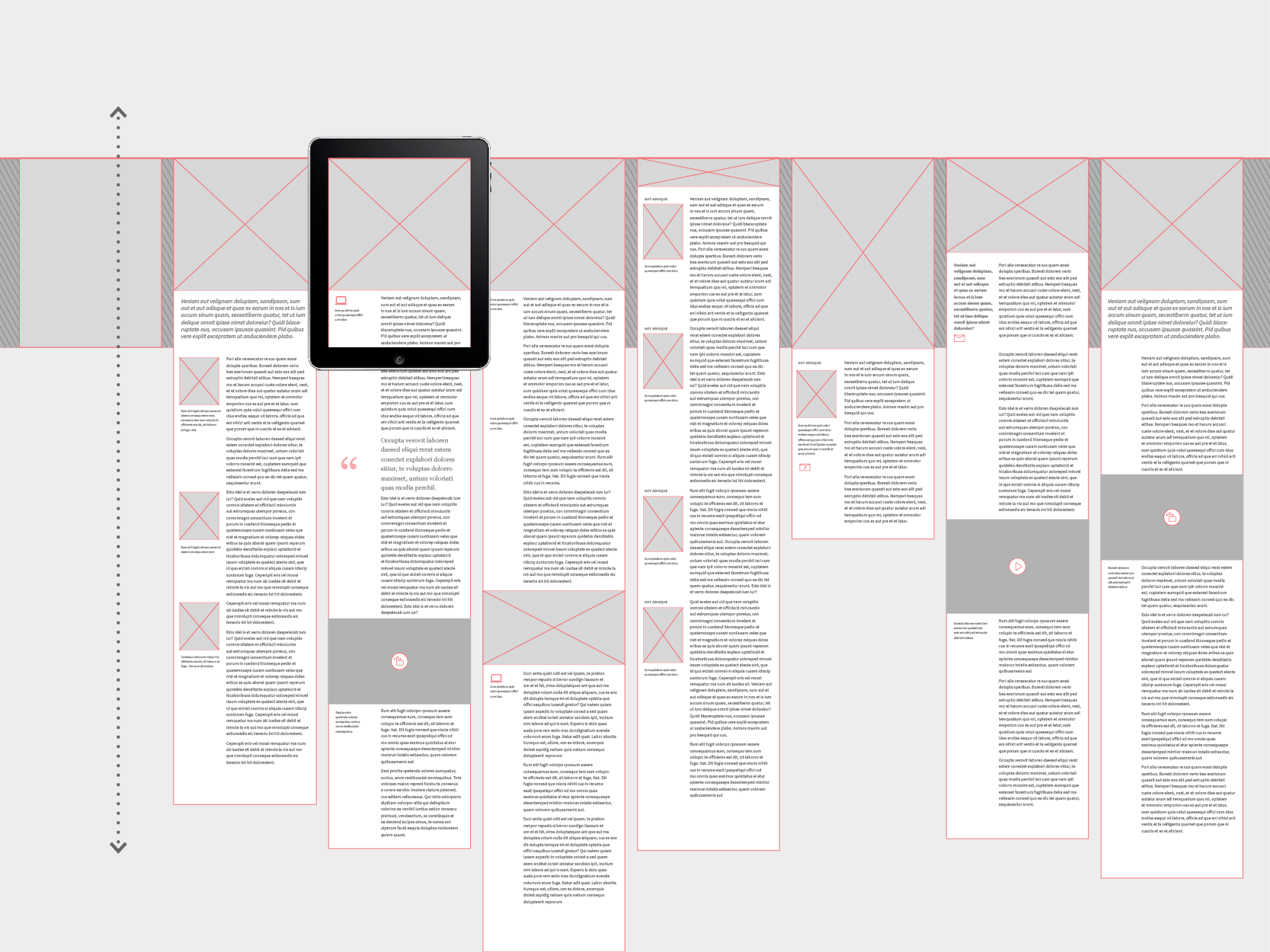
This brings us to the first of four macro structures in digital publications: scrolls on hanglines. This structure consists of a series of individual scrolls of different lengths hanging on a line and navigated vertically at the article level and horizontally from one to the next. In terms of design we have then a few considerations: 1. the scroll length; we see this “new irregularity” or “space on demand” principle where every stack of content is as lengthy as it needs to be; and 2. as desginers we are also determining how they are experienced. We can design for swiping in a continuous manner or swiping and locking screens into position, so that the view is always calculated. This kind of structure also tends to include an overview mode that reinforces the perception of the series of contiguous scrolls as a mental model of the book. It also gives the readers a sense of place as well as hint into the length of each piece and the book as a whole.
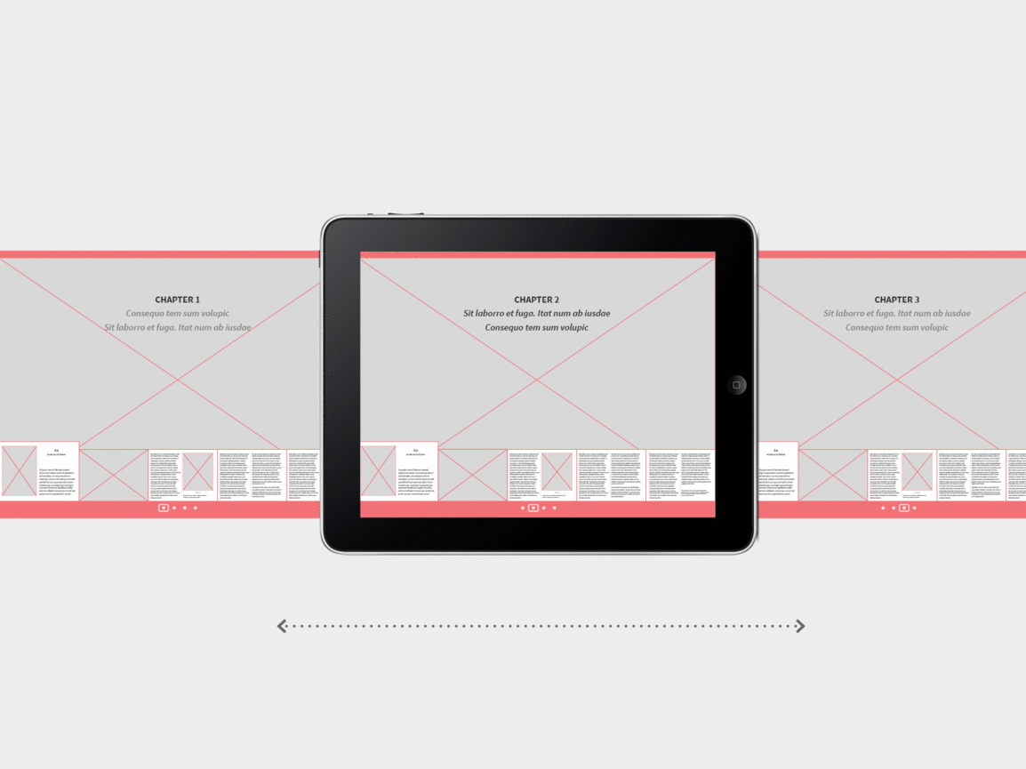 Meta Structure 02. Index Cards.
The second macro-structure is modelled after index cards sorting. This structure relies exclusively on a horizontal swipe to navigate content, but it also works around a dual view mode: 1. one is an overview mode of chapters with thumbnails of the pages. Scrolling the thumbnails is like going through index cards; sections are marked with a larger page/card; 2. and once the correct card is located it can be brought to a more straightforward full scale view. An early example of this structure, and a model for the iBooks platform, is Al Gore’s Our Choice. This model is developed with instructional materials in mind, hence the prevalence of image and dynamic media over text. The control over fixed layouts it offers have also made the platform particularly suitable for art, artist books and coffee table books in general.
 Meta Structure 03. Parallel Scrolls.
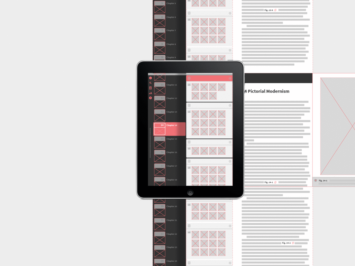
The third macro-structure consists of a series of parallel scrolls that function as a table of contents (TOC) and a final scroll that holds the content. This book structure is navigated by swiping horizontally and staking or folding over the previous scroll. Like the previous model, this framework is targeting textbook and reference books with complex hierarchies; we continue to see a prevalence of image base TOCs. Examples include the Inkling platform (i.e. Megg’s History of Graphic Design) and other similar ones, as seen in Josef Albers’s edition of Interaction of Color.
An interesting case study is the NYCPL Biblion books, where we see an attempt to visualize the length of the book in the TOC. These visual aids help establish a sense of position and progress in a digital book. Sometimes referred to as “spines,” they help the reader generate a mental model of the book and its structure.
 Meta Structure 04. Field.
The last formal structure is the field. This structure works with a duality of scale; the reader moves through the book by zooming in and out of content levels as well as paning once in the zoomed-in field. An example is WWF’s Together, where as content is zoomed into the field, we see more elements but also only have a partial view of the whole. A reverse example, starting with the field and zoom-in into specific works in the display is MoMA’s AbsEx. The field model is more and more common in children’s books where the reader explores scenes and constructs the story in a nonlinear manner, based on spatial exploration.
The Role of Dynamic Media & The Re-contextualization of Traditional Book Elements
Publications for screen environments include a range of dynamic media beyond video and image slideshows. We can identify very specific types:
Short Form Animation: moving images in article openers, such as auto panorama images that move slowly across the background back and forth, or dynamic visual cues (typically animated gifs) that guide interactions and reveal more content. The key consideration in this kind of dynamic images is that these are hierarchically subordinate and supporting elements that guide or create mood but are not content destinations themselves.
Layering: many traditional print elements such as notes, credits, captions, small text forms, are very often accessed through a tap interaction; they exist as layered elements to be revealed on demand. This can help us re-think the organization and hierarchy of small text elements in publication design not only through scale and position but also through layering and timing. Layering also acts as a mechanism to re-structure the relationship between text and image in publication as “space” is no longer finite but expansive through layers and scrolling.
Illusion of depth and 3D space: connecting a vertical swipe gesture to pulling and unfolding a paper note or passing through a room to check a catalogue of products in 3D space are some examples. A key factor is always maintaining feedback when tap gesture is used to reveal content.
A great example of digital publication that takes full advantage of dynamic media is Stipla Magazine in the Origami engine. We can see how using video as background helps set tone and context for a text. This and other techniques used in this framework arrive at very meaningful pairings of content and dynamic media that extends and defines the textual content, clarifying that ebooks and digital publications can be thought as essentially dynamic rather than as adaptations of print.
Some Challenges in Grids and Scale
A challenge of screen based publications is the limited screensizes in mainstream e-readers and tablets. It reduces our ability to produce works of significant visual intricacy, through the use complex grids and negative space, such as we are so familiar with in print.
The reality of a 7″ to 10″ tablet screen is that for continuous reading we are limited to single columns, or one column and side notes, in portrait orientation, and up to two columns of text in landscape mode for a comfortable measure. It is very hard to imagine a 4-5 column grid in this area without it looking disproportionate.
Another design consideration is the frame factor. The frame tends to make the role of the margin redundant. In screen based publications we typically see the margins very reduced in size in comparison to a printed book page.
One approach that can help us overcome size limitations and produce works of visual complexity and sophistication is the idea of dynamic layering. This requires a design approach that correlates layers and establishes thresholds for new layers to be activated. A great example of this approach is FUTU Paper, produced with a hybrid of Adobe Publishing platform and HTML content.
This integration of media and interaction in ebooks means a fundamental shift in design approach. We shift from static regular content to essentially and meaningfully dynamic design of multiple interacting elements and states in a path to a resting point.