COMD204Typographic Communication
Course Learning Outcomes. When students have completed this course they should be able to: 1. Apply basic visual elements and principles of design to typography; 2. Design with individual letters, words and short phrases for communication purposes; 3. Practice the basic steps of the design process in relationship to typographic design: problem identification, research, objectives and rationales, ideation, visualization, and documentation.; 4. Originate creative typographic solutions in response to design specifications and parameters; 5. Select, justify and apply appropriate typefaces, sizes, and weights for various print- and screen-based applications; 6. Recall the origins, development and characteristics of writing systems, alphabets and typefaces 7. Demonstrate fluency with basic typographic terminology; 8. Demonstrate skill with appropriate technical processes and materials to complete projects.
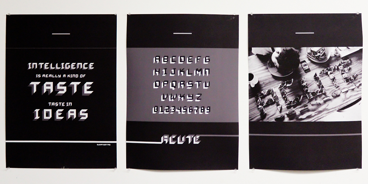
Acute by Benjamin Chan
Project 01: Modular Alphabet
Since the early XX century modernist experiments of Theo van Doesburg and Vilmos Huszár, designers have explored letterforms and alphabets constructed from a limited set of shapes. This is the same approach later used in the development of bitmap fonts of the 1980s. A restrictive palette of modular elements can, in spite of the apparent limitations, generate a wide range of solutions of unique qualities. In this project you are asked to create an alphabet (upper or lowercase) using only a small set of basic geometric shapes: a grid of squares or a grid of dots. They present their work in a series of posters and build the font using Fontstruct. Students are encouraged to explore large scale and three-dimensional applications of type in a quick exercise followig the project.
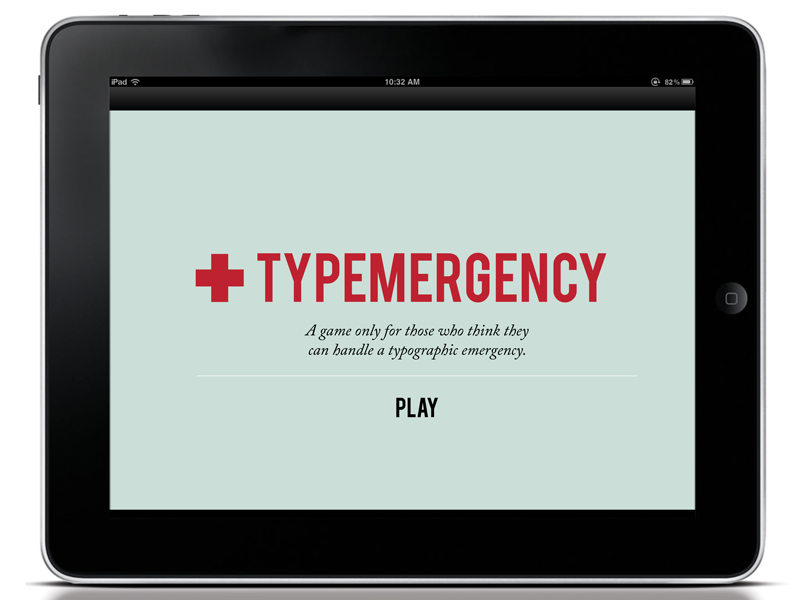
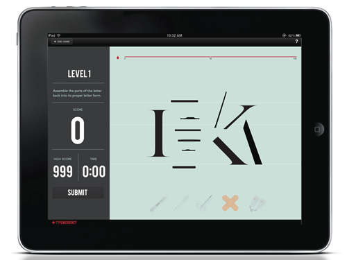
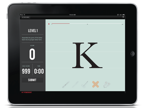
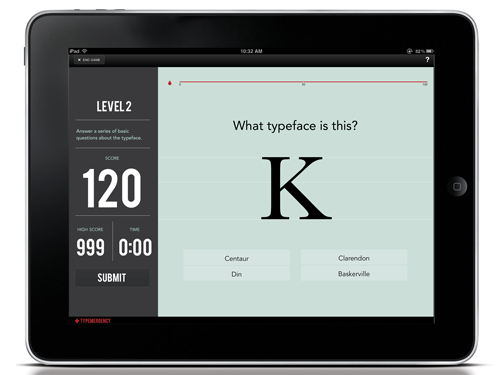
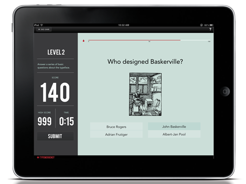
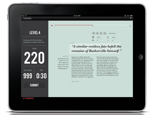
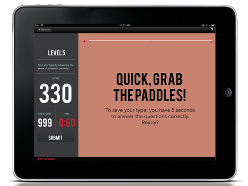
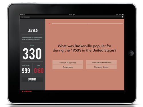
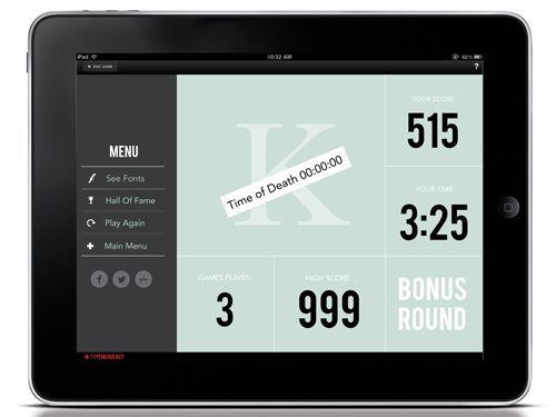
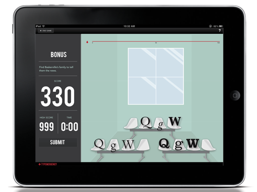
Typemergency, by Cheril Li. This game app includes a series of activities from questionnaires to rebuilding letterforms, kerning and general typesetting for each one of the six typefaces. If the player loses all points, the emergency mode kicks in and the player is prompted to a series of advanced questions to save the typeface. If nothing could be done and the type dies, the player needs to tell the family in the waiting room to learn more about them.
Project 02: 6 Typefaces
In this projects students identify 12 classic typefaces from a specimen and research their characteristics, who designed them and in what context. They use this research to select 6 of the typefaces and produce a piece of communication or tool that introduces a student like themselves to the uses and personality of the selected types.
Deliverables are not format specific to encourage a range of solutions and let students experiment with different media; students have produced a wide range of work in this project including study cards and postcards, but also three-dimensional objects, board games, websites and iPad applications.
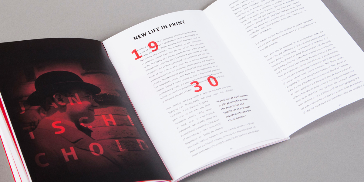
Typ6graphers publication design by Claudia Pasaribu
Project 03: Publication Design
In this project students design a print journal using the six required readings as copy. They are asked to illustrate the articles with relevant images and write captions for them. This project introduces the problematic of complex multipage documents and the use of systematic style sheets and grids.
These readings offer a foundation in typographic discourse from early to mid twentieth century. They include:
 
“Destruction of Syntax—Words In Freedom,” Filipo Tommaso Marinetti, 1913
“New Life in Print,” by Jan Tschichold, 1930
“The Crystal Goblet or Printing Should Be Invisible,” by Beatrice Warde, 1932
“Towards a Universal Alphabet,” by Herbert Bayer, 1935
“Designing Programmes,” by Karl Gerstner, 1964
“Grid and Design Philosophy,” by Josef Müller Brockmann, 1984